
Hotel Engine
Examples of the Impact of Design
November 2019 – January 2022
Overview
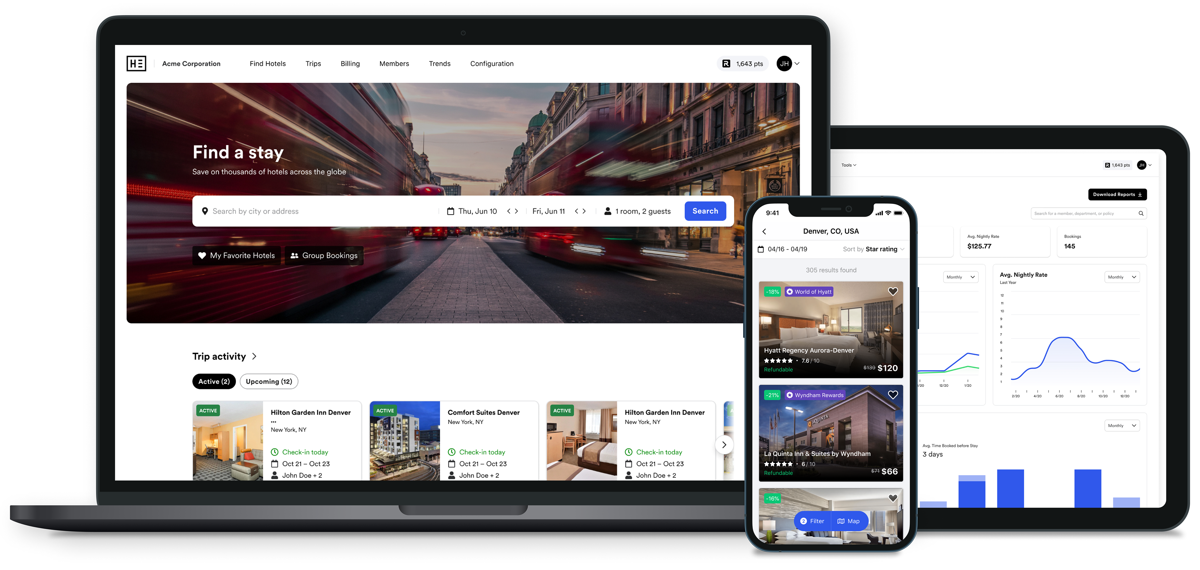
Modernizing a Growing Travel Platform
I joined Hotel Engine in 2019 as a UX Designer, and over more than three and a half years I progressed to a Senior Product Designer, helping to design a widely successful and industry competitive product.
In 2019 Hotel Engine was a true startup with little emphasis on design or usability. After helping to build a consistent foundation, as well as redesigning the site piece by piece, releasing a new mobile app, and addinng countless new features, Hotel Engine (or Engine) exploded into the business unicorn it is today.
More than half of my time at Hotel Engine was as the sole UX or Product Designer, partnering with the Head of Design, to rework the platform to modern standards. In this role I had an impact on all customer facing product enhancements, as well as impacts on defining our design frameworks, interaction patterns, and component libraries.
Project Summaries
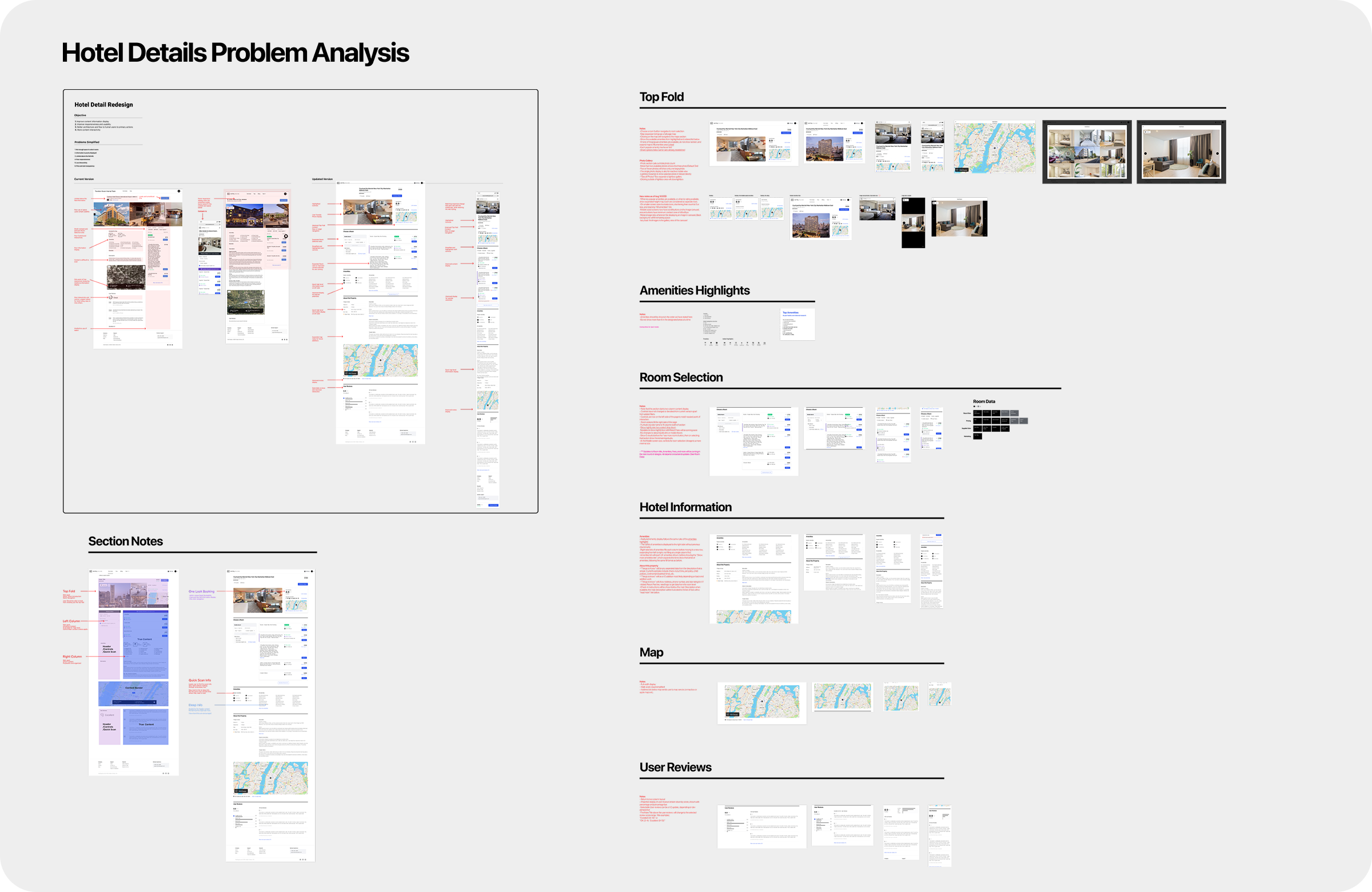
Below is a brief look at some of the projects, redesigns, and features I worked on during my time at Hotel Engine. Each breakdown gives a look at the prior interface, the updated designs, and a key element of focus along the way. Any look into the process behind a project is not intended as a comprehensive view at the design process, rather a brief view into some of the tools and techniques applied while working on a piece. Detailed case studies for each may be coming soon.
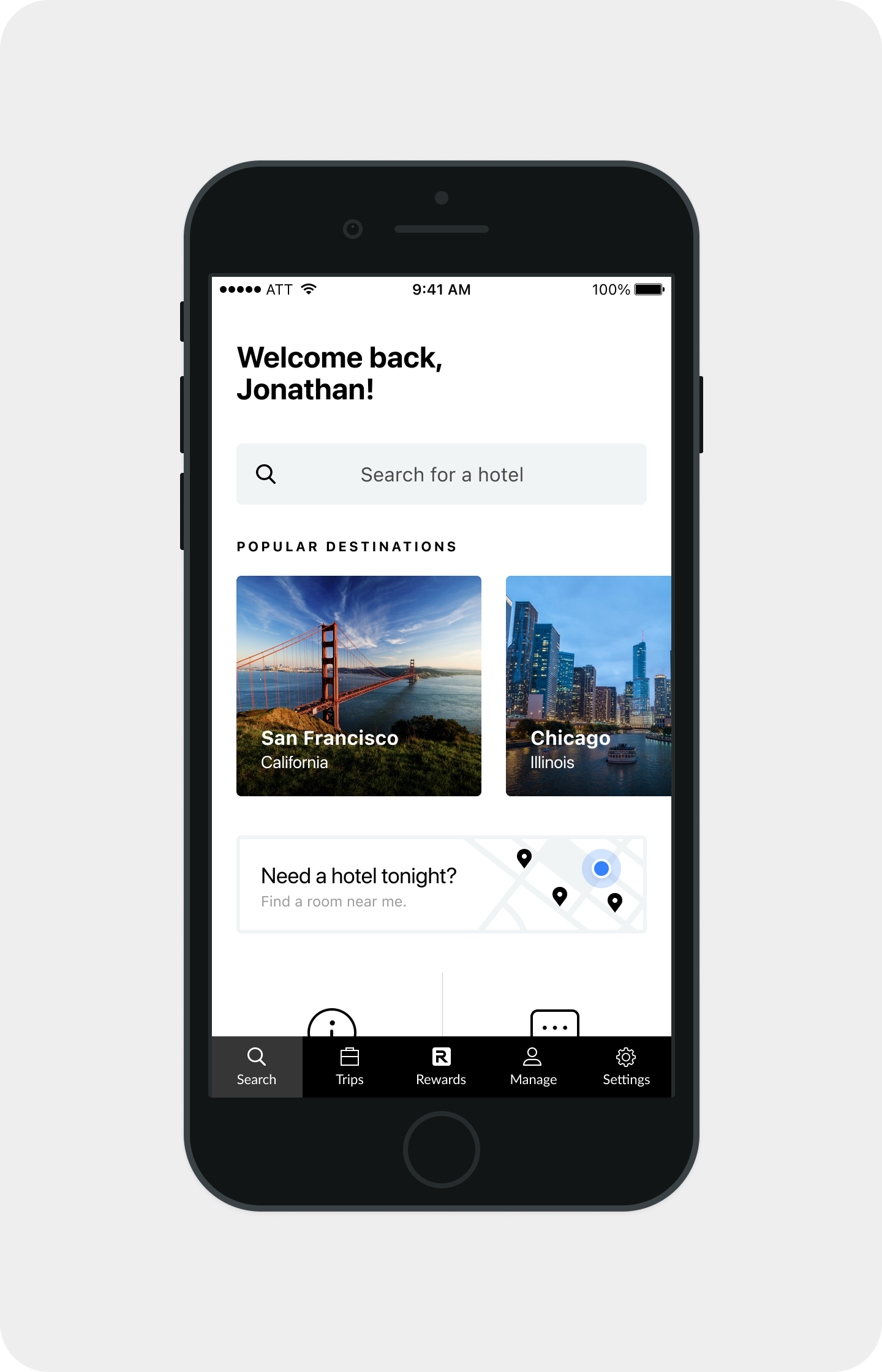
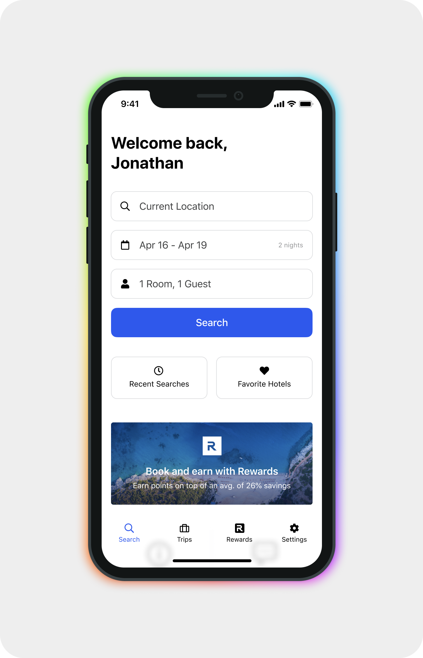
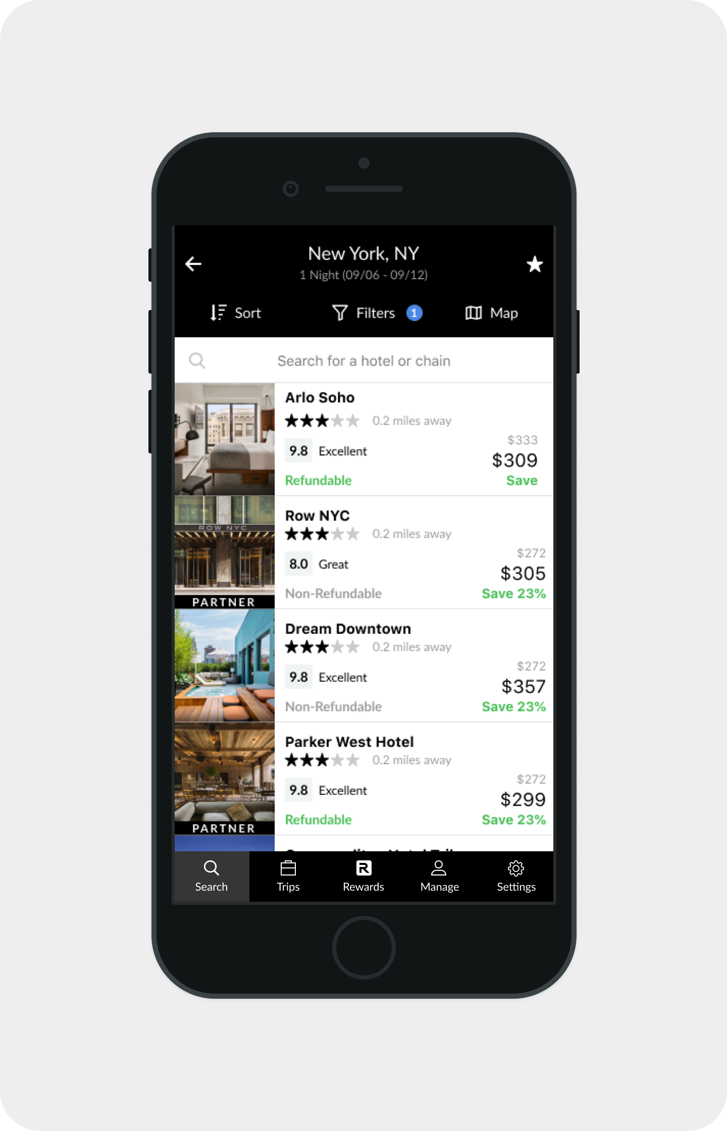
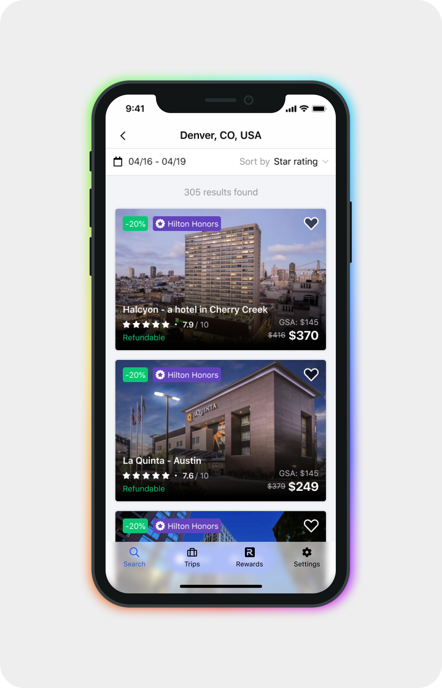
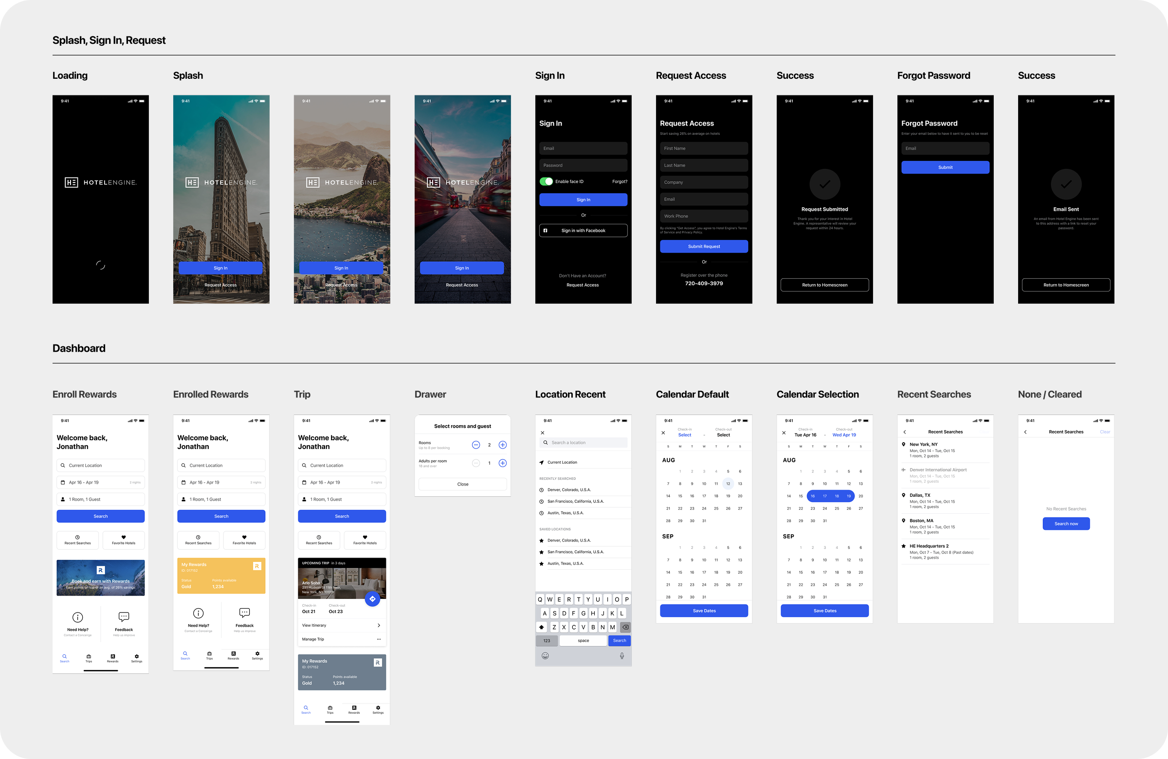
Mobile App Redesign
Standardizing outdated designs defining common patterns
When I first joined, the mobile app was in a sorry state, and was very rarely used by our core customers.
We first created a simple design system for the mobile app to better match new patterns on the desktop platform. I then went to work redesigning the app to match our updated platform, improved patterns, and new competitive standards.
The primary goal of this redesign was to create standardized pages, with repeatable patterns. Now this is nothing novel or unique, it was very necessary for the foundation of this new mobile app.
Impact
+35%
In App Bookings in first 30 days after release.
Later improvements to the Rewards, Loyalty, and group bookings functions with-in the app brought even larger returns.
Outside of the impact to the business, this redesign allowed the design and engineering team to iterate and deploy rapidly whenever a new feature was released to the primary platform, allowing us to ensure the native platform was always up to date with the core web platform.
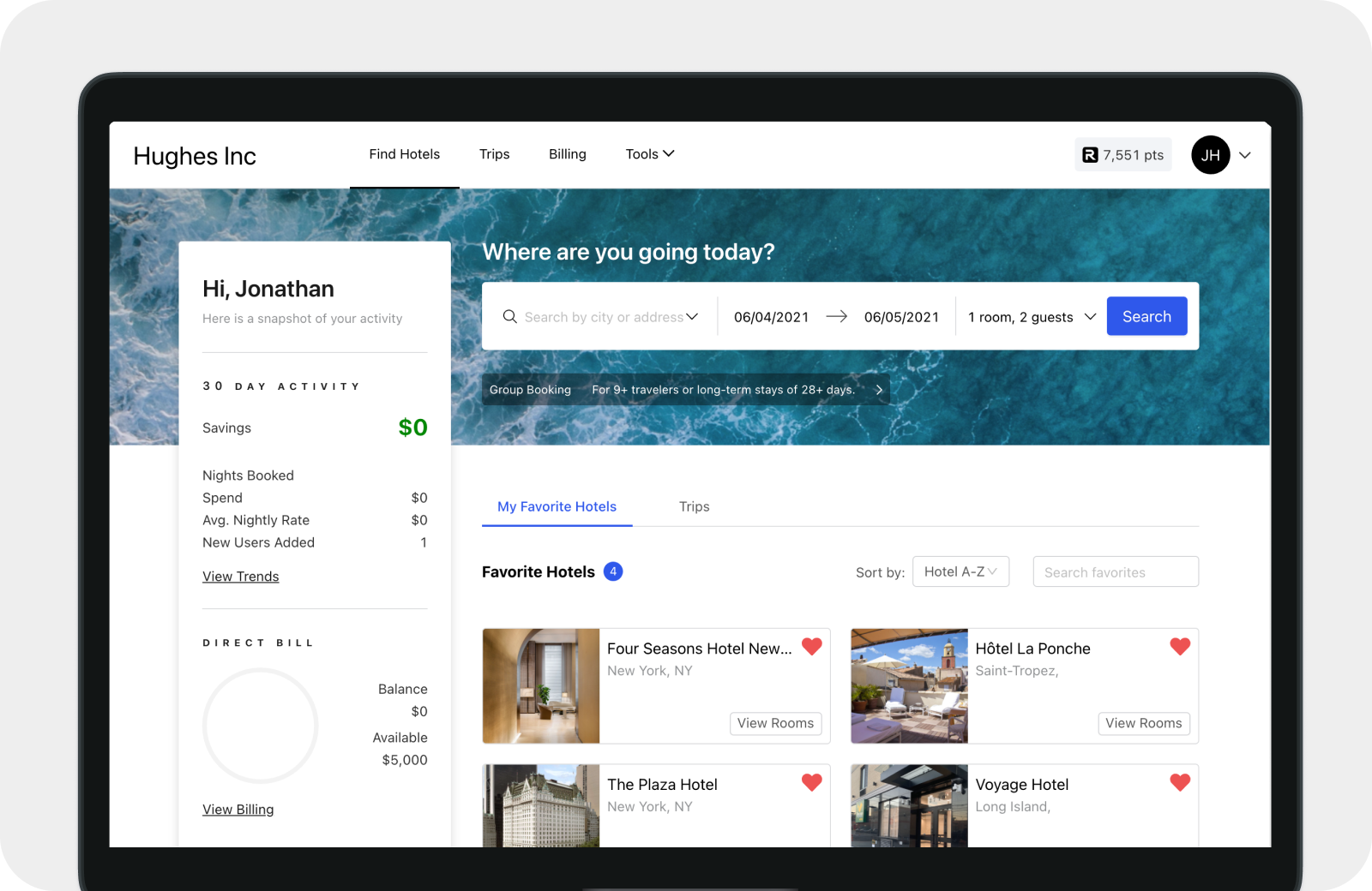
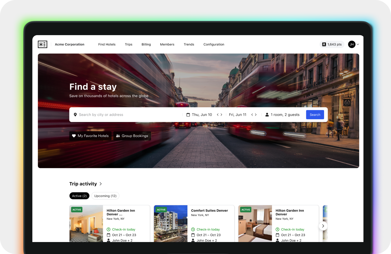
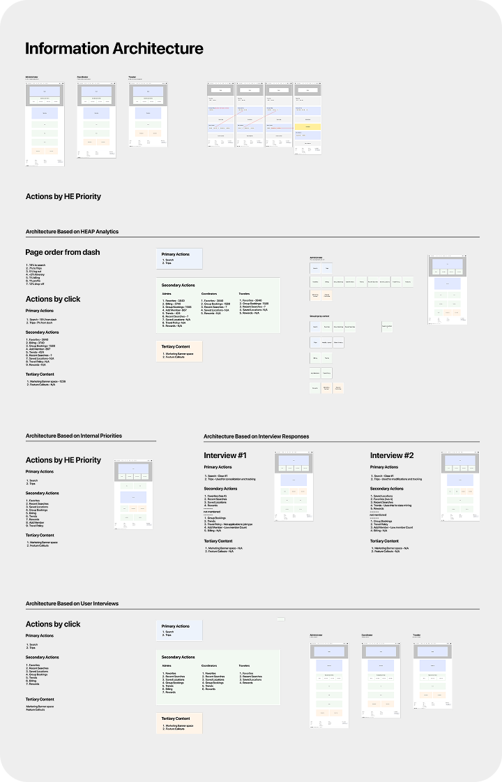
Dashboard Restructuring
Using Information Architecture to solve for unclear priorities
The dashboard page on the desktop was one of the most overlooked pages on the core site. For much of my time, the answer to, "Why is the Dashboard like this?" was simply, "because it's always been that way." There was little reasoning behind what was put on the dashboard, or what had priority at the top of the page.
The primary directive for this redesign was obvious, to encourage and direct users into their search for accommodations. The problem for this project quickly became how to prioritize and balance the secondary options.
With the existing structure being a mystery, I first went down the path of auditing what we had and why. Through annotation, competitive analysis, and the use of engagement data, the issues and the methodology to solve these issues quickly became apparent.
The next major step in redesigning the Dashboard, was to talk with customers and learn about their workflows and habits. This allowed us to measure the users priorities against the business priorities. Iterating through different architectures, with feedback from product and company leadership, we developed a consistent approach that focused on the primary points of engagement for the platform.
Impact
+22%
Increase in searches per user session.
This indicated that users were more likely to complete a booking search in an individual session, instead of leaving the platform after completing another action. We also saw ~8% decrease in support calls. This was a surprise, but after some more digging, we realized that users were spending less time searching for their trips. With some of users being super coordinators in charge of multiple travelers at a time, highlighting the currently active and upcoming trips reduced searching sped up users flows. This new design marked a watershed moment in the platform. Simplifying the page, focusing on the key actions, and creating a visually delightful experience showed the business that investing in quality design can improve on business metrics and on how the site is perceived. From this point on, visual impact became much more important for new designs and the business as a whole.
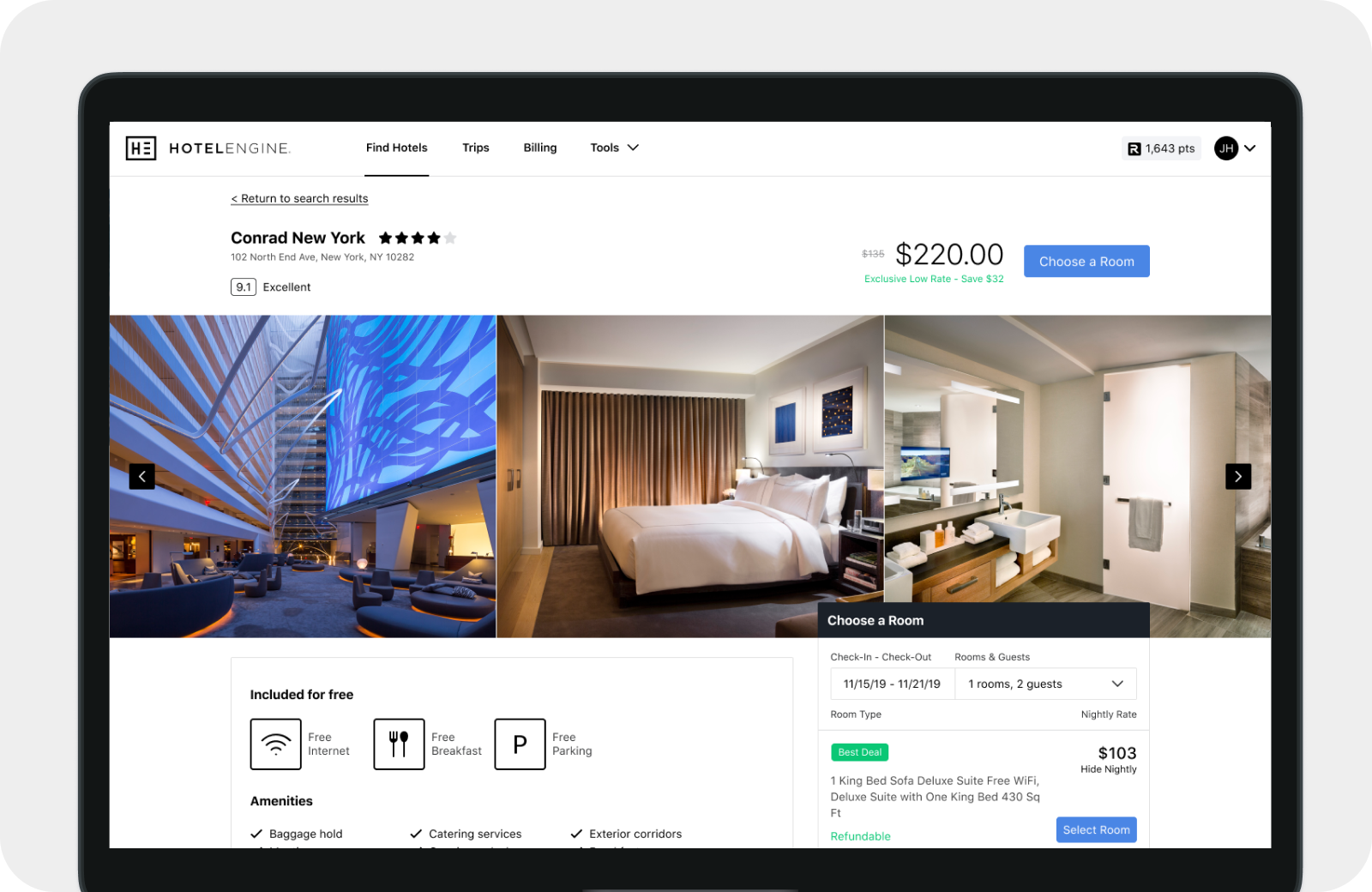
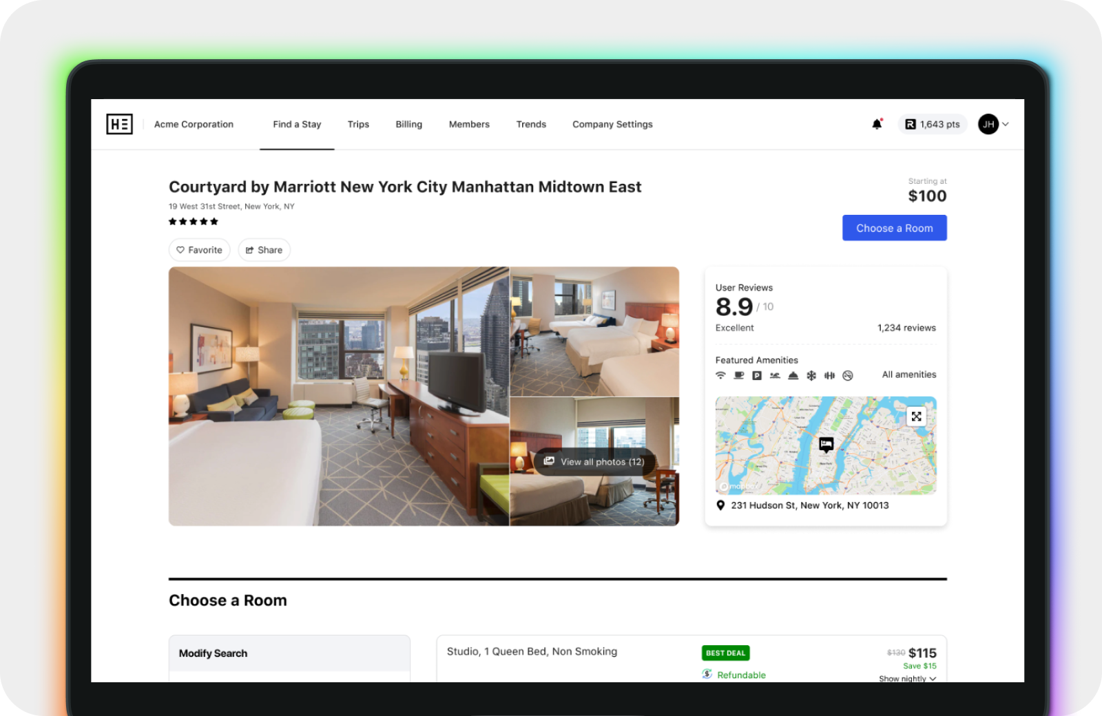
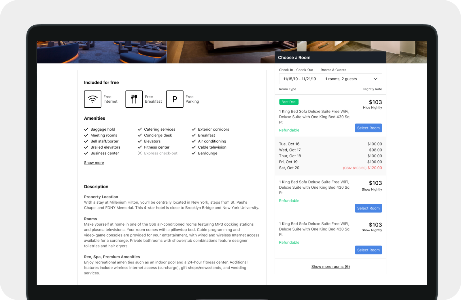
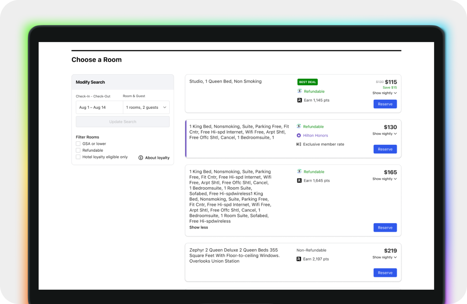
Hotel Property Page
Problem and Solution Analysis
During the early stages of my time at Hotel Engine, the property page had one of the lowest points of conversion for the whole site. At the time we did not have the tools or resources to properly identify where users were being lost in this process, so instead, along side the product team, we went through deep problem analysis until we found a list of key updates. After breaking the page into sections and redesigning the page, I presented this as testament to the solutions we implemented.
Impact
+15%
On page conversion
After improvements to not only the page design, but also the data we had available for room selection, the team improved conversion on this page by 15%. We saw that breaking the page into high level Hotel information at the top, then allowing for uninterrupted room selection below, allowed for quicker decisions to be made on the hotel itself and the available room selection. This meant less opening and closing of pages, faster decision making, and a more streamlined booking flow.
Prior to design, we did not have in-depth tools for conversion analysis, we instead used our best intuition to find where the problems existed. Simplifying the page and focusing in on core actions and information, showed once again how valuable basic experience, information, and visual design can be.
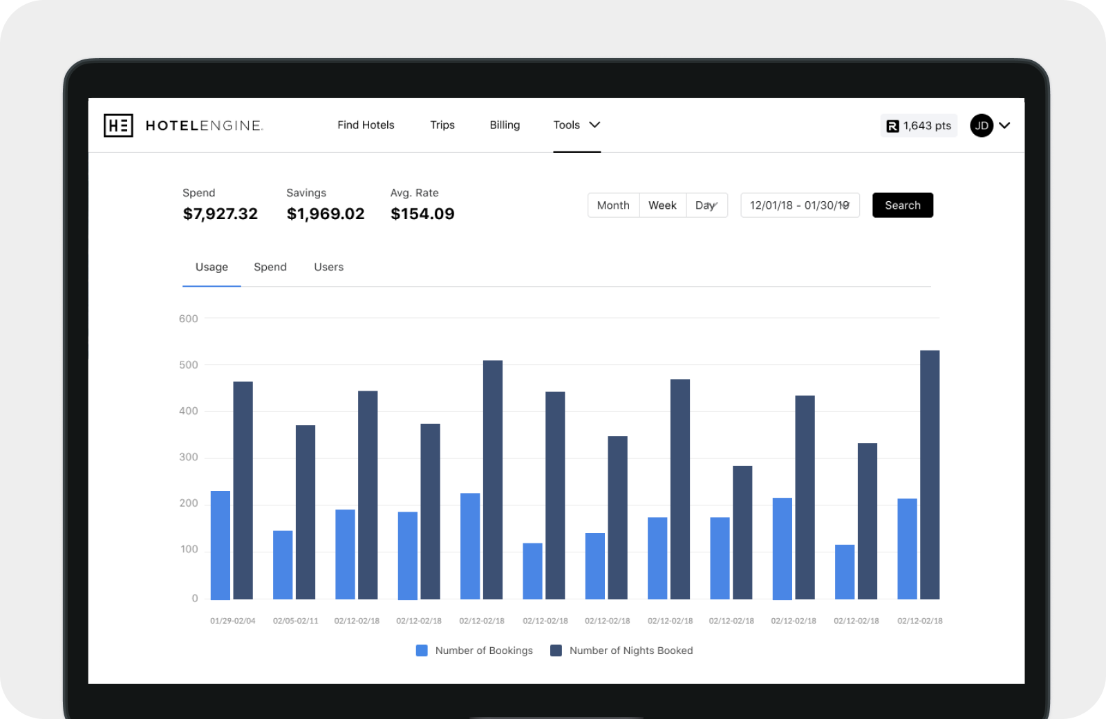
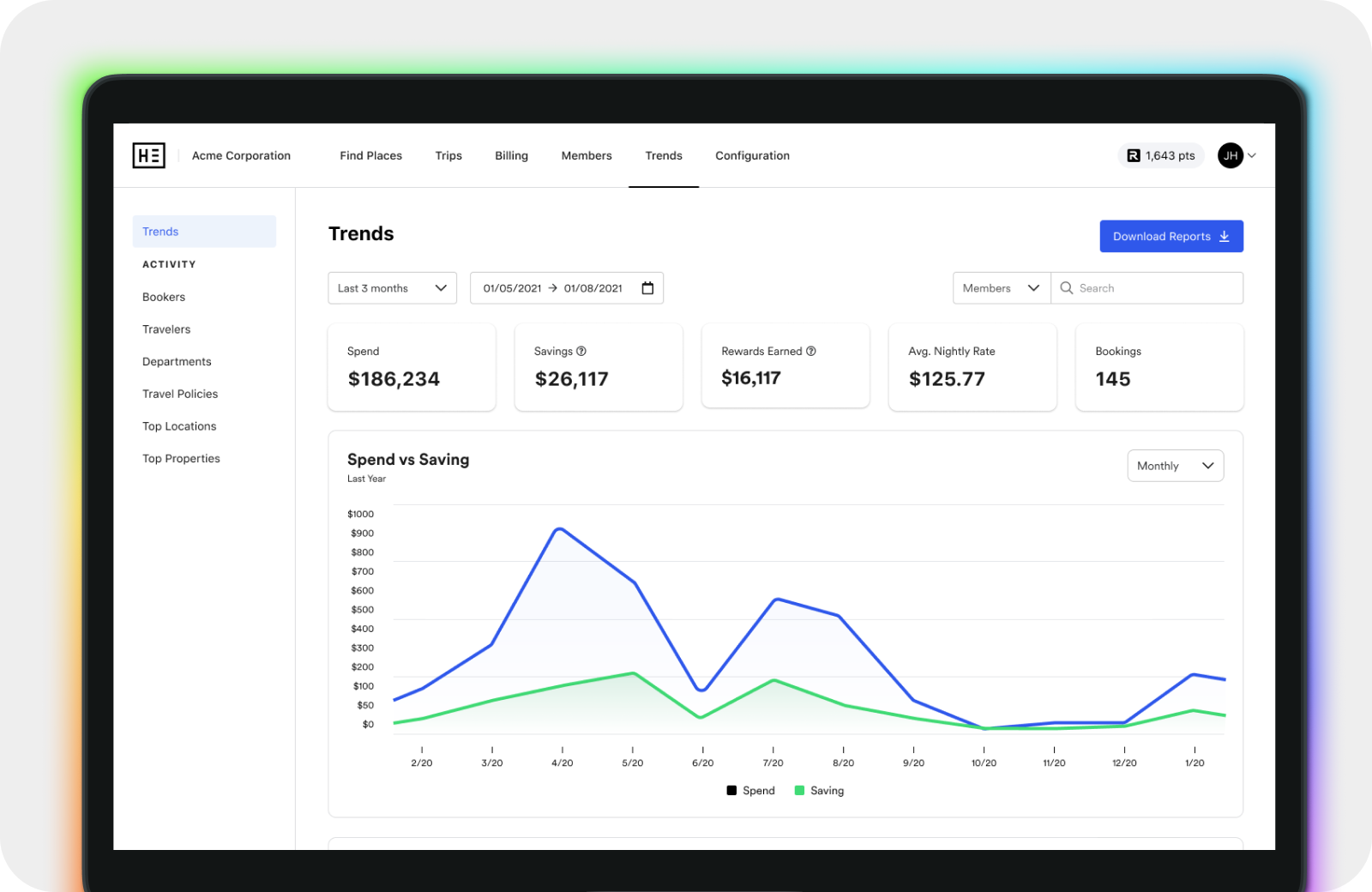
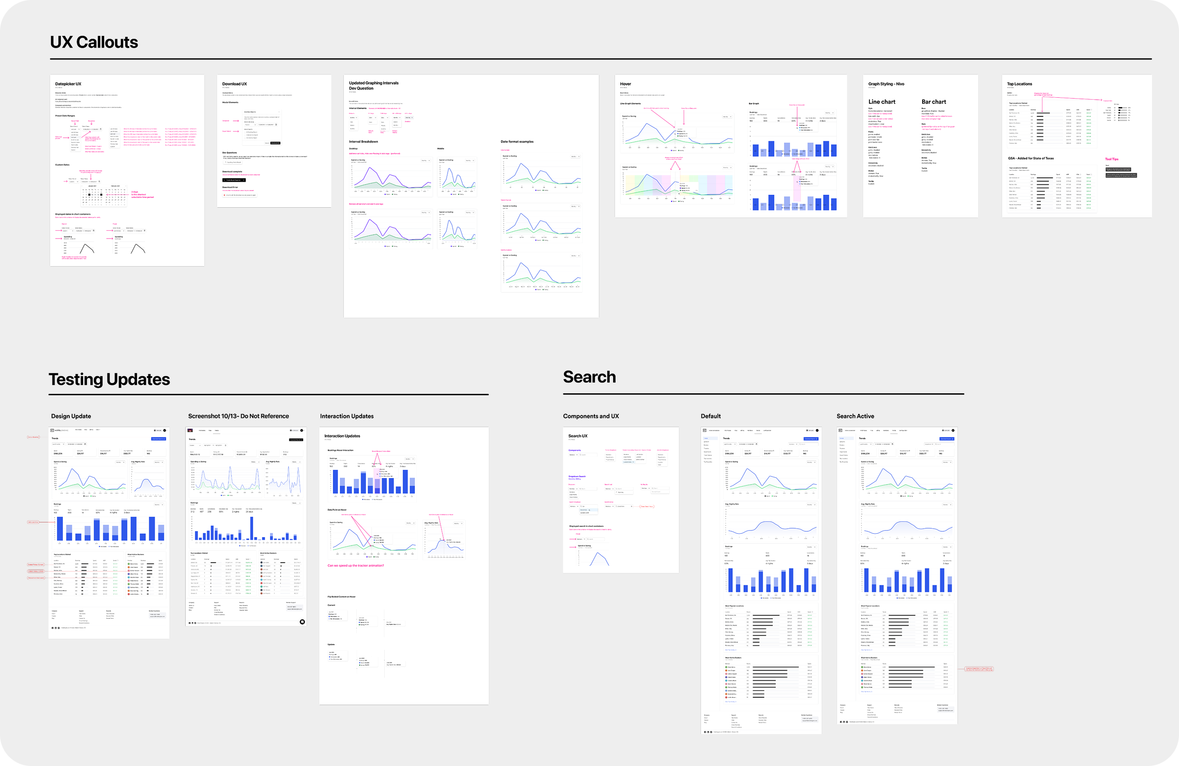
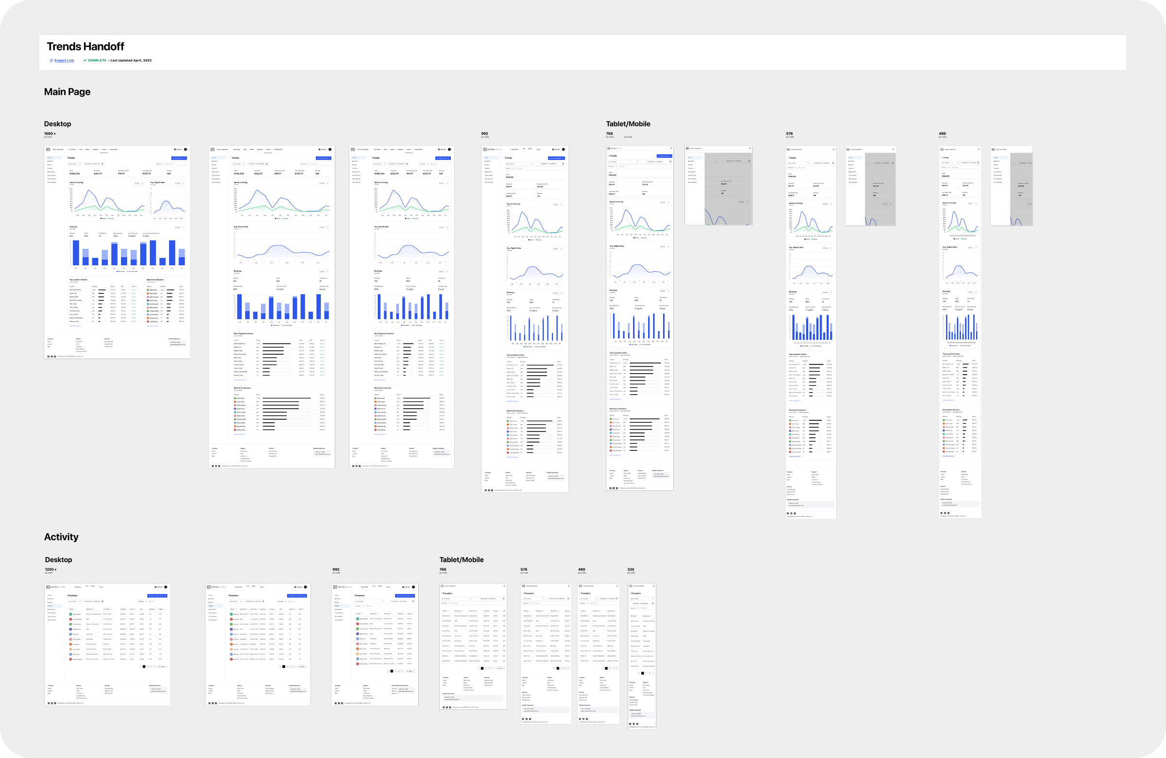
Interactions & Reporting
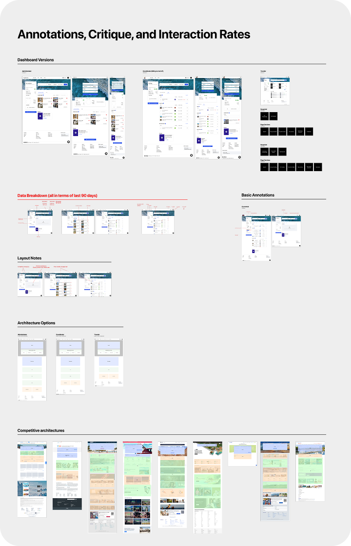
Communicating Nuance through UX Handoff and Annotations
Hotel Engine's travel reporting was, and is, one of the most utilized tool on the platform, and for that reason the interactions needed to be airtight. Interactions on graphs, interactive tables, filtering, and searching can be tricky to design well. The key to developing seamless experiences is to over-communicate the precise functionality.
This was a rare page that existed without proper responsiveness. These tools were seen as desktop only, with the idea that super users were only ever at their desk. We quickly decided that excuse was no longer valid. This added wrinkles to the interaction design on graphs and tables but getting these designs correct meant pulling the last elements of the platform into a mobile friendly view.
Completing this final piece of the design foundation meant that there were no future limitation on mobile or native designs, completing the ubiquitous nature of the platform.
Impact
The trends page redesign did not come with any ground breaking impact stats. Instead this marked a point in the progress of the platform toward true parity. We were now able to make the full site available on any device, and any screen size.This eventually led to many of the secondary pages being pulled into the mobile app. This marked a new standard for design and implementation, where everything had to be responsive and mobile friendly, which for a platform dedicated to travel, meant a lot for the core users.
My Contributions:
Product Design
Design Handoff, Communication with Product and Engineering, Design Critiques with Leadership.
UX Design
Wireframes, Rapid Prototyping, Information Architecture, Content Hierarchies, Site-maping, Interaction Patterns.
User Research
User journeys, Empathy Mapping, Competitive Analysis, User Surveys, User Interviews.
UI Design
Design System Audit, Component Creation.
Contact @:
gregory.blumer@gmail.com
LinkedIn:
linkedin.com/in/gregory-blumer/
Work
About
Gregory Blumer
Hotel Engine
Examples of the Impact of Design
November 2019 – January 2022
Overview
Modernizing a Growing Travel Platform
I joined Hotel Engine in 2019 as a UX Designer, and over more than three and a half years I progressed to a Senior Product Designer, helping to design a widely successful and industry competitive product.
In 2019 Hotel Engine was a true startup with little emphasis on design or usability. After helping to build a consistent foundation, as well as redesigning the site piece by piece, releasing a new mobile app, and addinng countless new features, Hotel Engine (or Engine) exploded into the business unicorn it is today.
More than half of my time at Hotel Engine was as the sole UX or Product Designer, partnering with the Head of Design, to rework the platform to modern standards. In this role I had an impact on all customer facing product enhancements, as well as impacts on defining our design frameworks, interaction patterns, and component libraries.
Project Summaries
Below is a brief look at some of the projects, redesigns, and features I worked on during my time at Hotel Engine. Each breakdown gives a look at the prior interface, the updated designs, and a key element of focus along the way. Any look into the process behind a project is not intended as a comprehensive view at the design process, rather a brief view into some of the tools and techniques applied while working on a piece. Detailed case studies for each may be coming soon.
Mobile App Redesign
Standardizing outdated designs defining common patterns
When I first joined, the mobile app was in a sorry state, and was very rarely used by our core customers.
We first created a simple design system for the mobile app to better match new patterns on the desktop platform. I then went to work redesigning the app to match our updated platform, improved patterns, and new competitive standards.
The primary goal of this redesign was to create standardized pages, with repeatable patterns. Now this is nothing novel or unique, it was very necessary for the foundation of this new mobile app.
Impact
+35%
In App Bookings in first 30 days after release.
Later improvements to the Rewards, Loyalty, and group bookings functions with-in the app brought even larger returns.
Outside of the impact to the business, this redesign allowed the design and engineering team to iterate and deploy rapidly whenever a new feature was released to the primary platform, allowing us to ensure the native platform was always up to date with the core web platform.
Dashboard Restructuring
Using Information Architecture to solve for unclear priorities
The dashboard page on the desktop was one of the most overlooked pages on the core site. For much of my time, the answer to, "Why is the Dashboard like this?" was simply, "because it's always been that way." There was little reasoning behind what was put on the dashboard, or what had priority at the top of the page.
The primary directive for this redesign was obvious, to encourage and direct users into their search for accommodations. The problem for this project quickly became how to prioritize and balance the secondary options.
With the existing structure being a mystery, I first went down the path of auditing what we had and why. Through annotation, competitive analysis, and the use of engagement data, the issues and the methodology to solve these issues quickly became apparent.
The next major step in redesigning the Dashboard, was to talk with customers and learn about their workflows and habits. This allowed us to measure the users priorities against the business priorities. Iterating through different architectures, with feedback from product and company leadership, we developed a consistent approach that focused on the primary points of engagement for the platform.
Impact
+22%
Increase in searches per user session.
This indicated that users were more likely to complete a booking search in an individual session, instead of leaving the platform after completing another action. We also saw ~8% decrease in support calls. This was a surprise, but after some more digging, we realized that users were spending less time searching for their trips. With some of users being super coordinators in charge of multiple travelers at a time, highlighting the currently active and upcoming trips reduced searching sped up users flows. This new design marked a watershed moment in the platform. Simplifying the page, focusing on the key actions, and creating a visually delightful experience showed the business that investing in quality design can improve on business metrics and on how the site is perceived. From this point on, visual impact became much more important for new designs and the business as a whole.
Hotel Property Page
Problem and Solution Analysis
During the early stages of my time at Hotel Engine, the property page had one of the lowest points of conversion for the whole site. At the time we did not have the tools or resources to properly identify where users were being lost in this process, so instead, along side the product team, we went through deep problem analysis until we found a list of key updates. After breaking the page into sections and redesigning the page, I presented this as testament to the solutions we implemented.
Impact
+15%
On page conversion
After improvements to not only the page design, but also the data we had available for room selection, the team improved conversion on this page by 15%. We saw that breaking the page into high level Hotel information at the top, then allowing for uninterrupted room selection below, allowed for quicker decisions to be made on the hotel itself and the available room selection. This meant less opening and closing of pages, faster decision making, and a more streamlined booking flow.
Prior to design, we did not have in-depth tools for conversion analysis, we instead used our best intuition to find where the problems existed. Simplifying the page and focusing in on core actions and information, showed once again how valuable basic experience, information, and visual design can be.
Interactions & Reporting
Communicating Nuance through UX Handoff and Annotations
Hotel Engine's travel reporting was, and is, one of the most utilized tool on the platform, and for that reason the interactions needed to be airtight. Interactions on graphs, interactive tables, filtering, and searching can be tricky to design well. The key to developing seamless experiences is to over-communicate the precise functionality.
This was a rare page that existed without proper responsiveness. These tools were seen as desktop only, with the idea that super users were only ever at their desk. We quickly decided that excuse was no longer valid. This added wrinkles to the interaction design on graphs and tables but getting these designs correct meant pulling the last elements of the platform into a mobile friendly view.
Completing this final piece of the design foundation meant that there were no future limitation on mobile or native designs, completing the ubiquitous nature of the platform.
Impact
The trends page redesign did not come with any ground breaking impact stats. Instead this marked a point in the progress of the platform toward true parity. We were now able to make the full site available on any device, and any screen size.This eventually led to many of the secondary pages being pulled into the mobile app. This marked a new standard for design and implementation, where everything had to be responsive and mobile friendly, which for a platform dedicated to travel, meant a lot for the core users.
My Contributions:
Product Design
Design Handoff, Communication with Product and Engineering, Design Critiques with Leadership.
UX Design
Wireframes, Rapid Prototyping, Information Architecture, Content Hierarchies, Site-maping, Interaction Patterns.
UI Design
Design System Audit, Component Creation.
User Research
User journeys, Empathy Mapping, Competitive Analysis, User Surveys, User Interviews.
Contact @:
gregory.blumer@gmail.com
LinkedIn:
linkedin.com/in/gregory-blumer/